eDreams Website Redesign
Simplifying the flight booking experience through research-driven, WCAG-compliant UX design that prioritizes clarity, trust, and accessibility.
Project Overview
The initial usability evaluation of eDreams.net revealed several critical issues that negatively impacted the flight-booking experience.
Participants consistently struggled with unclear navigation, overloaded filter menus, and low visibility of key interface elements such as the search bar and booking button.
These barriers increased cognitive load, reduced task efficiency, and weakened overall user trust in the platform.
The redesign focused on simplifying the visual hierarchy, improving readability and interaction flow,
and ensuring accessibility compliance while preserving eDreams’ recognizable brand identity.
User Insights from Usability Testing
“Too many ads make it hard to tell what belongs to the site.”
Participant 1
College Student“I wish I could change or cancel my flight without having to start over.”
Participant 2
Software Developer“Finding customer support took too long; it should be easier to contact someone.”
Participant 3
Freelancer / Remote WorkerProblem Definition
User interviews and initial usability testing revealed several pain points that disrupted the eDreams booking experience and reduced user trust. Participants reported being overwhelmed by excessive advertisements, cluttered filter menus, and hidden navigation options. They also expressed frustration with the lack of flexibility when changing plans, particularly around cancellations and refunds, and difficulty finding customer support when issues arose.
These usability barriers increased cognitive load throughout the booking flow, leading users to feel uncertain and less confident in completing their purchase.
The redesign addressed these challenges by reducing interface clutter, simplifying task flows, and making customer support and modification options more discoverable. The goal was to enhance clarity, flexibility, and accessibility while maintaining eDreams’ recognizable brand identity.
Research & Insights
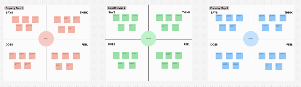
The research phase combined qualitative and quantitative UX methods to define user needs and design priorities. I created an empathy map in Figma to synthesize user emotions, behaviors, and pain points identified during four user interviews. Next, I conducted a heuristic evaluation based on Nielsen’s 10 Usability Heuristics and facilitated usability testing with participants completing key booking tasks. The findings revealed recurring challenges in discoverability, filter logic, and visual consistency. These insights directly informed design priorities focused on clarity, hierarchy, and accessibility.
Design Process
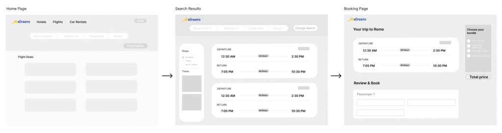
Guided by the research insights, I developed low- and mid-fidelity wireframes in Figma to redesign three critical pages: the Homepage, Flight Results, and Payment page. The new layout repositioned the search bar at the top of the homepage for immediate visibility, introduced collapsible filter categories to reduce cognitive load, and enlarged the “Book Now” button to improve affordance and visibility. High-fidelity prototypes emphasized visual consistency, responsive spacing, and color contrast ratios compliant with WCAG standards. Typography and iconography were refined to establish a modern, legible, and trustworthy interface.
Testing & Outcomes
Following the redesign, I conducted post-usability testing with the same participants to validate improvements. Results demonstrated measurable gains and confirmed that the revised hierarchy and simplified filters reduced confusion and improved trust.
30%
Faster task completion times across all three pages.
+4 pts
Ease-of-use scores increased from 5–8/10 to 9/10.
100%
Users successfully located customer support without guidance.